Recipe
Travel Card
A bold travel-package card composing the library's media, sticker, chip, and display primitives into a single brutalist promo. Hero banner, trip highlights, price, and a call to action — responsive down to mobile.
Preview
/ 3N
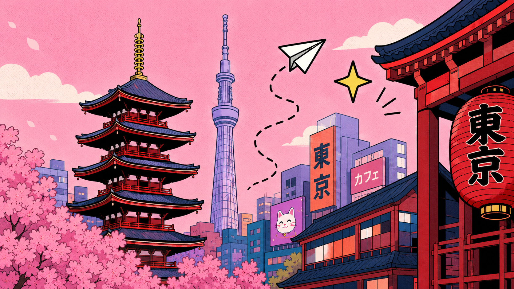
 Roam & Go
Tokyo
City Escape
Explore iconic neighborhoods, savor local flavors, and make unforgettable memories.
$799
Central
Locations
Locations

Guided
Experiences
Experiences

24/7
Support
Support
Code
Structural template. See the example source for the full implementation.
Imports
import {
  NbButton,
  NbButtonTrailingIcon,
  NbCallout,
  NbChip,
  NbCluster,
  NbDisplay,
  NbIcon,
  NbMediaFrame,
  NbMediaItem,
  NbMediaItemTitle,
  NbSection,
  NbSplit,
  NbStack,
  NbSticker,
  NbSurface,
  NbText,
} from '@ng-brutalism/ui';
Composition skeleton
<article nbSurface>
  <div nbMediaFrame>
    ...
  </div>

  <div nbSplit>
    <section nbStack>
      ...
    </section>

    <aside nbStack>
      ...
    </aside>
  </div>

  <footer nbSection divider="top">
    <div nbSplit>
      ...
    </div>
  </footer>
</article>
Click 'Show more' to view additional details.
Template
<div nbCluster justify="center" padding="xl" class="travel-stage">
<div nbSurface clip tone="cream" border="strong" shadow="hard" radius="xl">
<!-- Hero banner with floating sticker -->
<div class="relative">
<nb-sticker
shape="burst"
tone="mint"
[rotate]="-12"
aria-label="4 days, 3 nights"
class="absolute top-2 left-2 z-20"
>
4D<br />/ 3N
</nb-sticker>
<div nbMediaFrame ratio="21/9" radius="none" shadow="none" border="none">
<img src="/tokyo-city-escape/hero-illustration.png" alt="Illustrated Tokyo" />
</div>
</div>
<!-- Headline + trip meta -->
<div nbSplit ratio="2:1" gap="xl" padding="lg" collapse="md" separator="solid">
<div nbStack gap="lg">
<div nbCluster gap="md" align="center">
<img src="/tokyo-city-escape/roam-go-logo.png" alt="Roam & Go logo" class="w-16" />
<span nbText size="xl" weight="extrabold">Roam & Go</span>
</div>
<h1 nbDisplay class="uppercase">Tokyo<br />City Escape</h1>
<p nbText size="md" weight="medium" tone="muted" measure="md">
Explore iconic neighborhoods, savor local flavors…
</p>
</div>
<div nbStack gap="lg" align="start">
<div nbChipGroup direction="vertical" gap="sm" align="start"
radius="sm" shadow="none" transform="uppercase" tracking="wide">
<span nbChip tone="mint">
<span nbIcon src="/tokyo-city-escape/nb-plane-fill.svg" size="sm" decorative></span>
Flight included
</span>
<span nbChip tone="lavender">Hotel</span>
<span nbChip tone="pink">Top pick</span>
</div>
<div nbCallout tone="yellow" size="xl" shadow="hard">$799</div>
</div>
</div>
<!-- Features + CTA -->
<div nbSection divider="top" padding="lg">
<div nbSplit ratio="2:1" gap="lg" collapse="md">
<div nbCluster gap="lg" align="center" separator="dashed">
<nb-media-item size="xs" icon="/tokyo-city-escape/central-locations.png">
<span nbMediaItemTitle>Central<br />Locations</span>
</nb-media-item>
<nb-media-item size="xs" icon="/tokyo-city-escape/guided-experiences.png">
<span nbMediaItemTitle>Guided<br />Experiences</span>
</nb-media-item>
<nb-media-item size="xs" icon="/tokyo-city-escape/24-7-support.png">
<span nbMediaItemTitle>24/7<br />Support</span>
</nb-media-item>
</div>
<button nbButton tone="lavender" size="xl" radius="md">
<span nbText size="xl" weight="black" transform="uppercase" tracking="wide">
Book Trip
</span>
<span nbButtonTrailingIcon shape="circle" tone="inverse" size="md">
<span nbIcon src="/tokyo-city-escape/nb-arrow-right.svg" size="sm" decorative></span>
</span>
</button>
</div>
</div>
</div>
</div>Click 'Show more' to view additional details.
Primitives used
- nbSurface— bordered card shell
- nbMediaFrame— hero banner image
- nbSticker— 4D/3N highlight burst
- nbDisplay— destination mega title
- nbStack— vertical rhythm for card regions
- nbSplit— responsive main-and-aside layout
- nbSection— section border and padding
- nbText— body copy and brand text
- nbChip— flight / hotel / top-pick tags
- nbIcon— decorative chip and button icons
- nbCallout— price callout
- nbCluster— logo row and wrapping feature group
- nbMediaItem— icon + label trip features
- nbButton— book trip call to action
- nbButtonTrailingIcon— button icon treatment
Layout breakdown
How it is composed
nbSurfaceOuter card shell — owns tone, radius, shadow, border, and clip.nbMediaFrameHero banner image filling the full card width at the top.nbSticker4D / 3N highlight burst floating over the hero image.nbSplitTwo-column responsive layout separating headline/description from tags/price.nbStackVertical rhythm within the headline column and the tag/price column.nbClusterLogo row and wrapping chip group for trip features.nbSectionFeature strip at the bottom — padded with a top divider.nbCalloutPrice highlight — large, loud, and offset-shadowed.nbChipFlight, hotel, and top-pick metadata tags.nbButtonBook Trip call-to-action at the bottom.