Neo-Brutalist Angular Media Item
Media Item
Use nb-media-item to pair an icon or image with a title and optional description. Covers feature lists, event details, product specs, flight info, contact rows, status chips, and any layout that anchors text next to a visual.
Preview
Your Flight
NYC → CDGJun 14 · 22:15 → 12:45+1
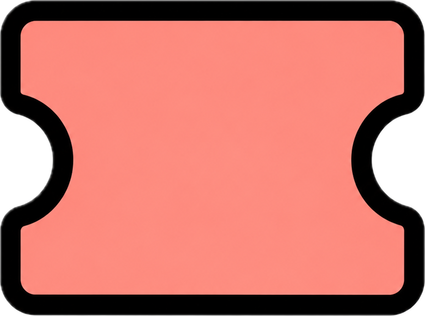
Seat 14AEconomy · Window
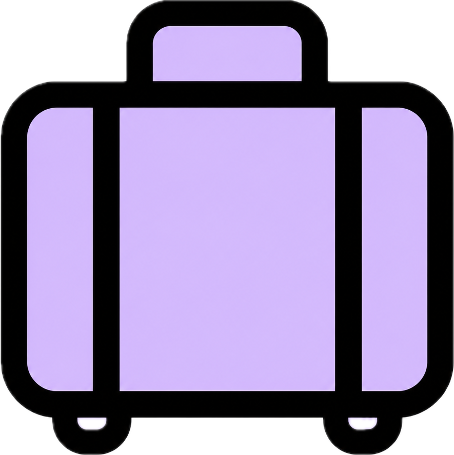
1 checked bag23 kg max
Usage
Use inputs for icon, title, and description in the common case. Project custom content with nb-media-item-icon, nb-media-item-title, and nb-media-item-description when you need custom markup.
Import
import { NbMediaItem, NbMediaItemTitle, NbSeparator, NbSurface } from '@ng-brutalism/ui';Template
<div nbSurface border="strong" layout="stack" radius="sm" shadow="hard" clip>
  <div class="border-b-2 border-(--nb-border) bg-(--nb-accent) px-4 py-3 text-(--nb-accent-foreground)">
    <span class="font-heading text-2xl uppercase leading-none">Your Flight</span>
  </div>

  <div class="flex flex-col p-4">
    <nb-media-item
      variant="plain"
      class="pb-3"
      style="--nb-media-item-icon-size: 2.5rem; --nb-media-item-title-size: 3rem; --nb-media-item-title-font-family: var(--font-heading)"
      icon="/icons/plane.png"
      iconAlt="Flight"
      description="Jun 14 · 22:15 → 12:45+1"
    >
      <span nbMediaItemTitle>NYC → CDG</span>
    </nb-media-item>

    <div class="flex flex-col gap-2">
      <hr nbSeparator variant="dashed" />

      <nb-media-item
        variant="plain"
        icon="/icons/ticket.png"
        iconAlt="Ticket"
        iconBackground="#ff6aa2"
        title="Seat 14A"
        description="Economy · Window"
      />

      <hr nbSeparator />

      <nb-media-item
        variant="plain"
        icon="/icons/baggage.png"
        iconAlt="Baggage"
        iconBackground="#dcc8ff"
        title="1 checked bag"
        description="23 kg max"
      />
    </div>
  </div>
</div>
Click 'Show more' to view additional details.
Variants
PlainNo container — just gap, icon size, and typography
Premium AccessUnlimited features
BoxedHard border with offset shadow and tone fill
Premium AccessUnlimited features
ChipFully-rounded pill — great for status or tags
Premium AccessUnlimited features
Orientations
Horizontal
Travel Photos128 shots
Vertical
Travel Photos128 shots
With description
Add description for secondary context. It renders below the title with reduced opacity and follows the component size preset.
Boarding Pass
Boarding PassSeat 14A · Economy
24/7 SupportResponse within 2h
Sizes
SM — Checked BaggageUp to 23kg included
MD — Checked BaggageUp to 23kg included
LG — Checked BaggageUp to 23kg included
Alignment
Start — default, left-aligned content
Global Network140+ destinations
Center — centered content
Global Network140+ destinations
Between — stretches to full width
Global Network140+ destinations
API
nb-media-item
| Input | Type | Default | Description |
|---|---|---|---|
| variant | 'plain' | 'boxed' | 'chip' | 'plain' | Visual container style. boxed adds a border and shadow; chip uses a fully-rounded pill shape. |
| orientation | 'horizontal' | 'vertical' | 'horizontal' | Controls whether the media and text stack side-by-side or top-to-bottom. |
| align | 'start' | 'center' | 'between' | 'start' | Horizontal distribution of children. between stretches the item to full width. |
| size | 'sm' | 'md' | 'lg' | 'md' | Sets gap, padding, icon size, and font size together. |
| tone | NbToneToken | 'default' | Shared color tone — writes background, foreground, and border color. Background paint applies to boxed and chip variants. |
| icon | string | undefined | Image source for the media icon. |
| iconAlt | string | '' | Accessible alternative text for the input icon. |
| iconBackground | string | undefined | Wraps the input icon in a framed surface with the provided fill. |
| title | string | undefined | Primary label. Use nbMediaItemTitle for custom title markup. |
| description | string | undefined | Secondary label. Use nbMediaItemDescription for custom description markup. |
CSS Tokens
| Token | Default | Description |
|---|---|---|
| --nb-media-item-icon-size | Depends on size | Controls projected and input icon dimensions. |
| --nb-media-item-title-size | Depends on size | Controls title text size for input and projected titles. |
| --nb-media-item-title-font-family | var(--font-sans) | Controls title font family without adding utility classes to the title slot. |
| --nb-media-item-description-size | Depends on size | Controls secondary label text size. |
Sub-directives
| Directive | Description |
|---|---|
| nbMediaItemIcon | Media slot for an icon or image. Add surface to use the built-in icon frame and background to adjust its fill. |
| nbMediaItemTitle | Primary label. Rendered in black font weight with tight leading. |
| nbMediaItemDescription | Secondary label below the title. Rendered at 75% size with reduced opacity. |